Overview
Healthy Living Care is an NDIS-registered support provider based in Australia, focused on delivering compassionate, personalized care that empowers participants to live independently and confidently.
The client wanted a website that felt playful, welcoming, and colorful — while still maintaining professionalism, trust, and NDIS credibility. The goal was to move away from the typical “clinical” disability provider look and instead create something warm, human, and approachable for families and participants.
Brand Identity, Visual Language, Ui/Ux Design
The Challenge
The biggest challenge was balancing playful design with regulatory trust. NDIS websites must feel reliable, compliant, and structured — but the client specifically wanted something vibrant and friendly to stand out from competitors.
Additionally, the website needed to:
- Clearly communicate NDIS eligibility and services
- Build trust with families and carers
- Maintain accessibility-friendly layouts
- Present testimonials and proof in a clean structure
- Feel emotionally reassuring without looking childish
Creating a colorful interface without losing professionalism was the core design challenge.
Website Design & Development
Healthy Living Care
Adelaide, Australia
Ongoing
The Solution
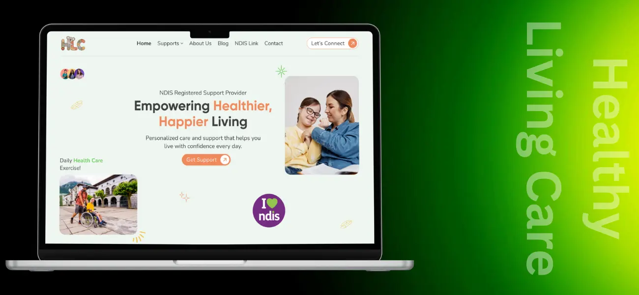
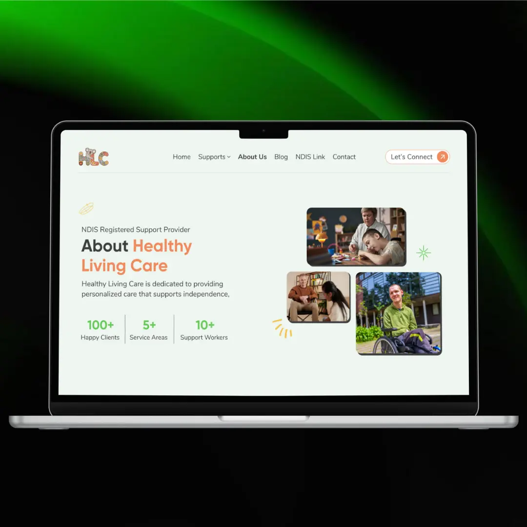
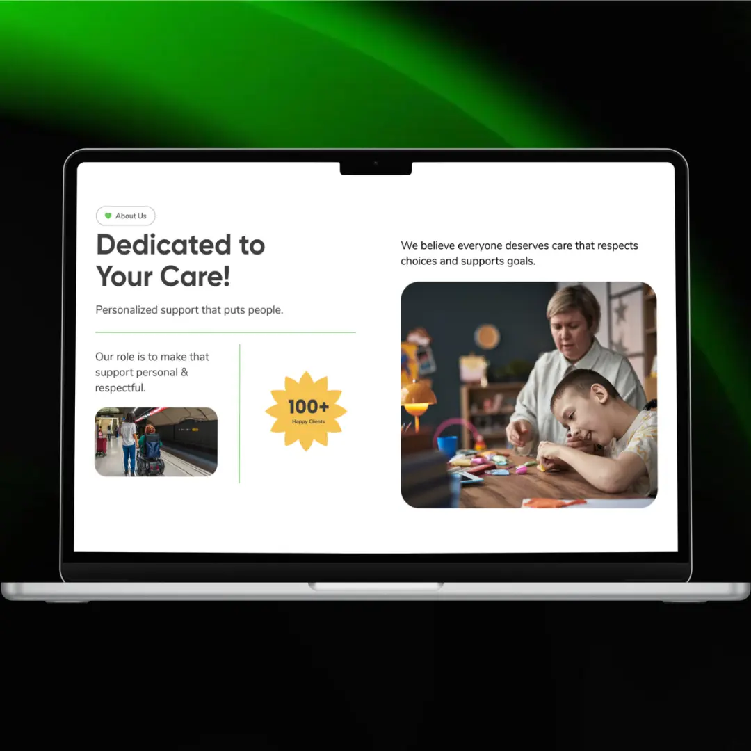
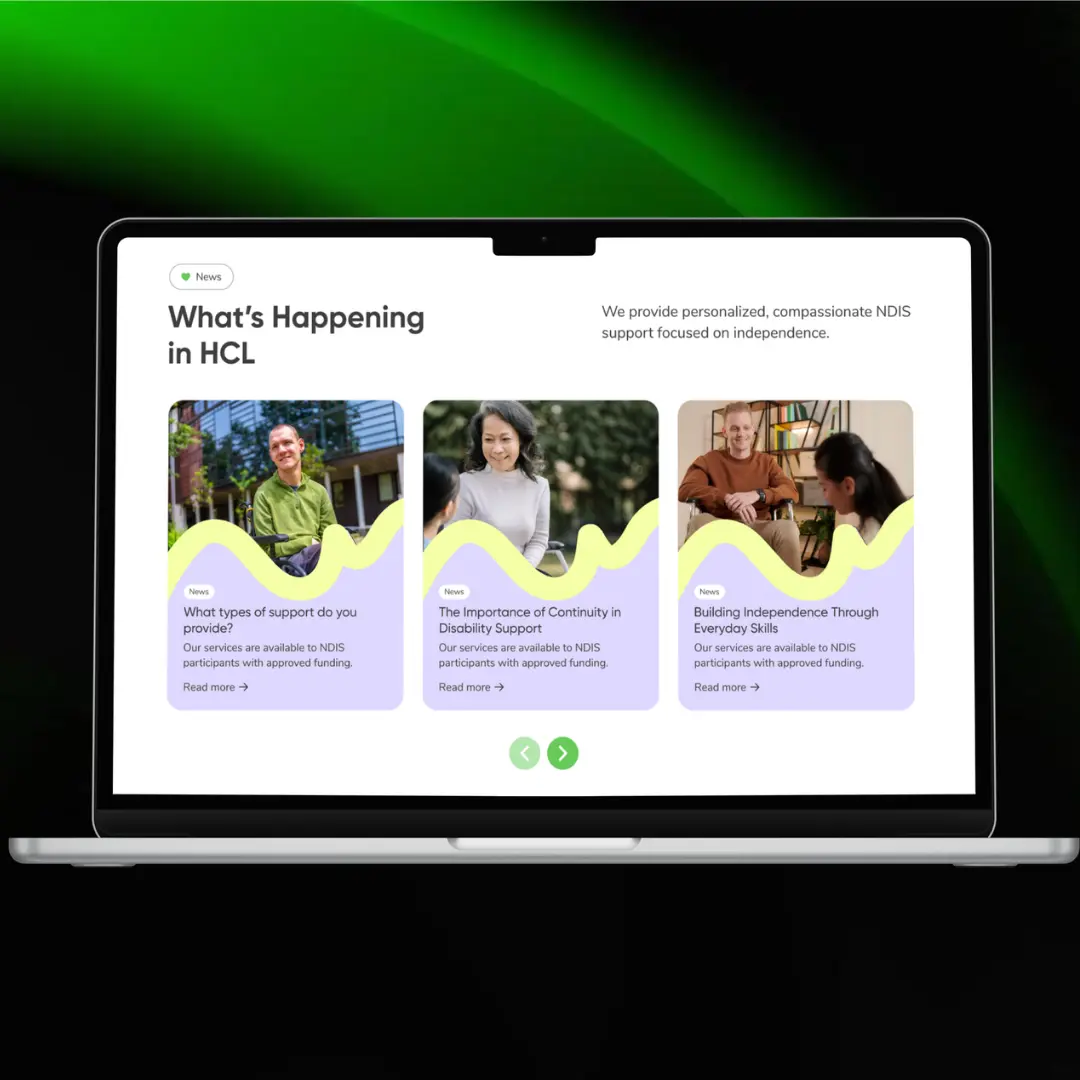
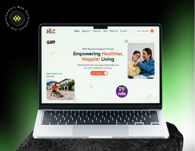
I designed a modern, colorful, and emotionally engaging interface that reflects warmth, care, and independence. Instead of using heavy clinical colors, I introduced a soft pastel-based palette with vibrant accents to create a friendly and welcoming feel.
The layout was structured to guide visitors through trust-building steps:
- Clear hero positioning as an NDIS Registered Provider
- Emotional storytelling through supportive imagery
- “Why We Are the Best” credibility section
- Testimonials to reinforce social proof
- FAQ section to reduce friction and answer compliance-related concerns
The visual elements, rounded cards, soft shapes, and playful accent graphics were carefully integrated to create personality — while keeping the structure clean and readable for accessibility.
The final result is a website that feels human-first, family-friendly, and trust-driven.
Our Process
The project followed a strategy-first execution approach, focused on clarity and emotional connection.
- Brand Tone & Visual Direction Planning
- Competitor Analysis (NDIS Market in Australia)
- Color Psychology & Playful UI Design
- Accessibility-Conscious Layout Structuring
- Trust & Conversion Flow Optimization
Result Driven
The final website successfully differentiates Healthy Living Care from traditional NDIS providers by presenting a brand that feels warm, supportive, and modern. The playful design enhances emotional connection while the structured layout ensures clarity and trust. Testimonials, FAQs, and service explanations are positioned strategically to reduce hesitation and improve enquiry intent. The brand now communicates both professionalism and compassion — strengthening credibility while remaining approachable to participants and their families.
Tech Stack :
Clients Feedback
Sed ut perspiciatis unde omnin natus totam rem aperiam eaque inventore veritatis
Hardik is truly dedicated to meeting client expectations. He communicates effectively, demonstrates great patience, and is highly reliable.


